Do you want to view the mobile version of a website on computer browser? You’re in the right place.
In this tutorial, I will guide you on how you can view the mobile and iPad version of a website on your desktop browser.
Technology is very rapidly shifting towards small and portable devices. People today prefer to use smartphones over computers for browsing the internet, that’s why Googlebots, web crawlers give preference to those websites or webpages which are responsive and mobile-friendly.
How to View Mobile Version of Website on Desktop
You can view the mobile version of a website on any browser like Mozilla Firefox, Opera, Microsoft Edge, etc, but here I am guiding you on how you can view the mobile version of a website on Google Chrome, since it is the most widely used browser. The procedure is same for all browsers.
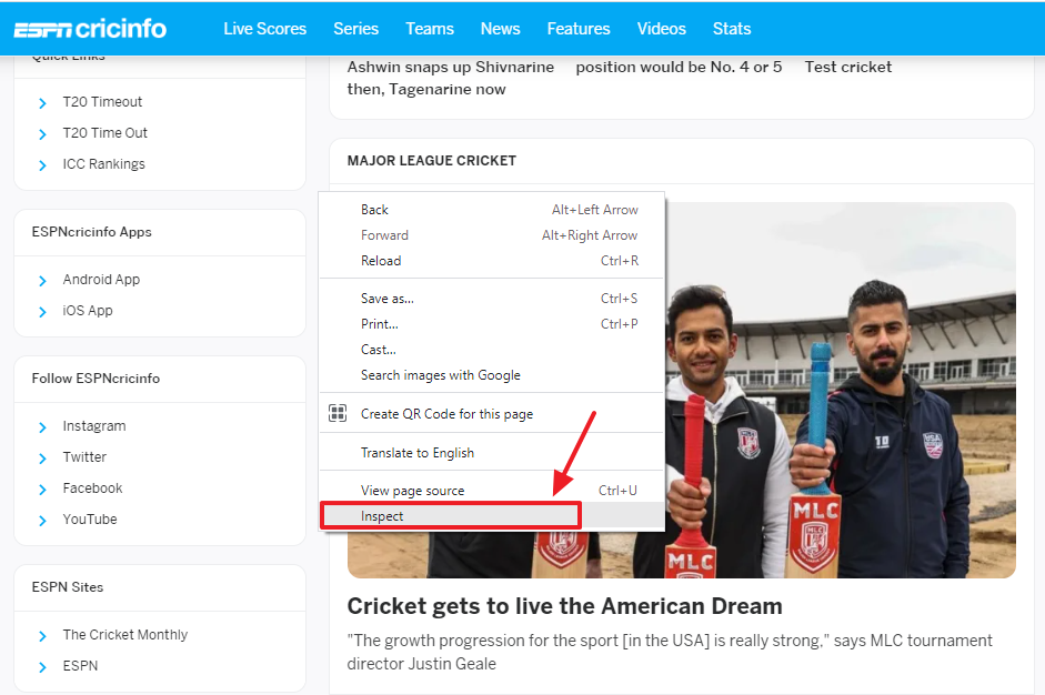
- Open the website on your browser.
- Press F12 or right-click and click on the Inspect. It opens the Developer Tool.

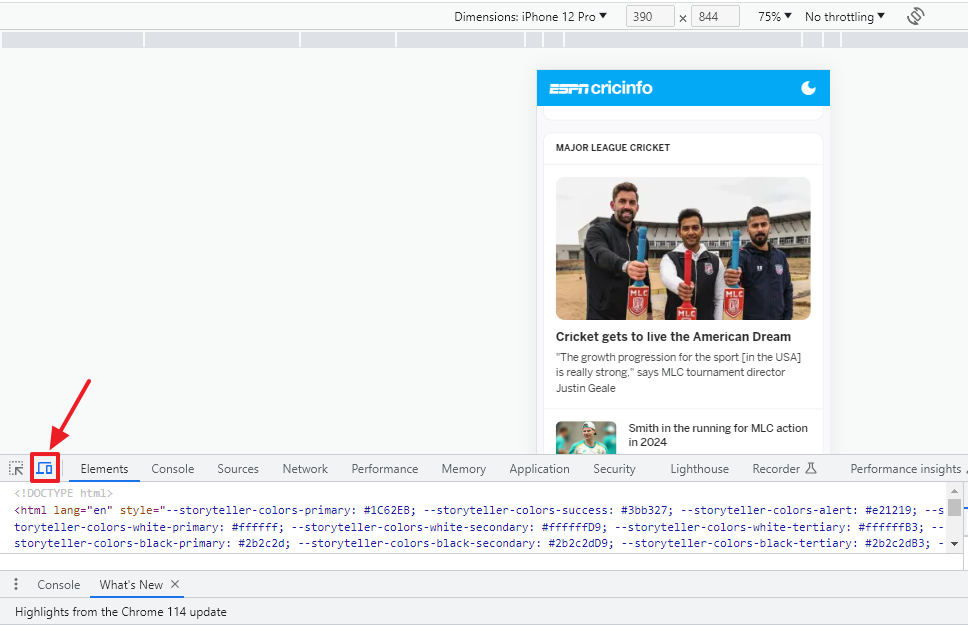
- Click on the Toggle device toolbar icon located at the bottom-left corner of your browser.
- It will turn the desktop view of a website to mobile view. Below you can see the mobile version of a website. You can scroll up and down and can open any menu or link.

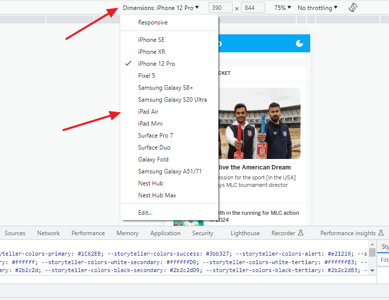
- Go to Dimensions located at the top of the page.
- Click on the Downward arrow to choose a device like iPhone, Pixel 5, Samsung Galaxy, iPad, Surface Pro, Nest Hub, etc, to preview the website on it.
- Click on the Edit to add more devices. You can give custom size as well.
- To close the mobile view, click on the Toggle device toolbar icon again.

Tip:
You can also test your website for various screens (Laptop, Mobile, Desktop, iPad, Tablet) by doing Zoom In and Zoom Out on your browser.
Press “CTRL” + to increase the size, means it will show you how your website looks on smaller screens. Press “CTRL +” 5 or 6 times to see the mobile version of website on normal browser view. Press “CTRL -“ to see the website view on large screens. To go back to your original view press “CTRL 0”.

Also Read
- How To Fix Chrome Error On Android “Aw, Snap! Something Went Wrong While Displaying This Webpage”
- How To Stop Google Chrome Ads Popping-Up At Bottom-Right Of Desktop | Disable Notifications In Chrome
- How to Clear Cache, History, Cookies, on Chrome, Firefox..
- How To Fix Secure Connection Failed On Firefox And This Site Can’t Be Reached Error On Chrome


Leave a Reply